
Meta
META | TYPE SPECIMEN
SCROLL DOWN
Meta
META | TYPE SPECIMEN
META | INTRODUCTION
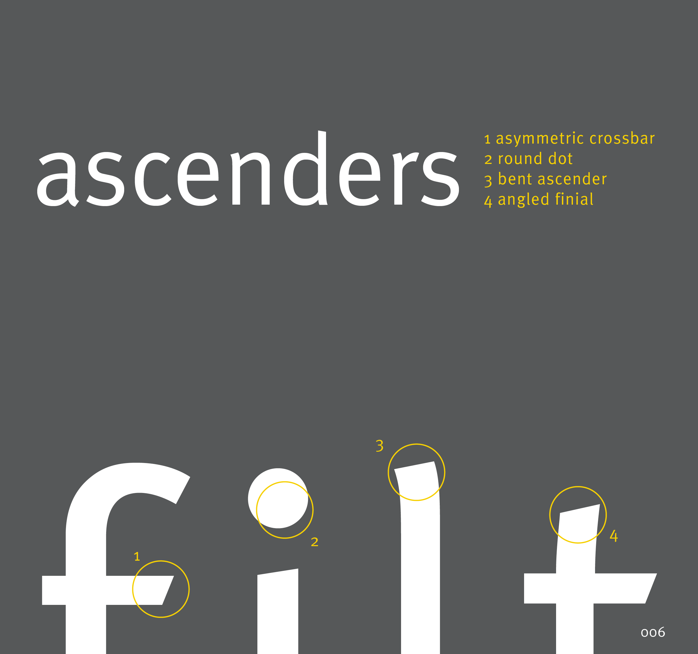
Commissioned by the Deutsche Bundespost, Meta was intentionally designed to be legible at small point sizes on cheap paper. The West German Post Office ultimately opted not to use Meta in favor of Helvetica. With this origin story in mind, the final book's form was designed to mimic a piece of mail to be returned to sender, or in this case to its typographer, Erik Spiekermann. Inside, the type specimen offers detail into the history, creator and essences of the Meta with emphasis on the unique characteristics of each letterform that collectively achieve its inherent legibility.


META | SELECT SPREADS & STANDARDS